check out https://www.genymotion.com/ for device emulation across many versions of android
Yeah I use genymotion emulators for my main job. VS comes with emulators which is how I did my testing. I don’t see some issues in the emulators which are in the actual devices.
Having this work on the iPad is just a matter of flipping a switch in the Apple store and uploading iPad screenshots. Buttttt. It already looks like hot garbage in landscape mode so I am worried it’s gonna be a big PITA to fix the UI for iPads too. Let me file a bug for it and see how much it sucks in the iPad emulators first 
This guy codes.
Version 1.4.0 has hit the Play Store and App Store. Includes a display of the IFPA rules page and also a settings page where you can turn on/off notification types.
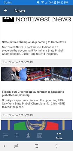
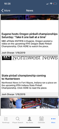
News page on Android is rendering a little weird. Most of the graphics are getting clipped strange and have a chunk of dead space between the graphic and the text.
This was actually an intentional design decision to make every news item appear similar on the summary page, so the image is cropped so every news item has the same image height. When you go into the actual news item it shows the variable height of the image.
Problem is there’s not a lot of consistency between images so they’re often severely cropped.
If any designers wanna help me with layouts, I’d love the help. @bondorew cough cough
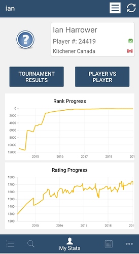
I will post my biggest feature request. I love the charts, but almost all “new” players entered around 10000, so there is no granularity on the section I care about. How I am suppose to obsess about the weekly changes when I can’t see them!
both charts are up and to the right. I’ve been told that’s good!
I’ll file a bug and see if there’s a way I can implement creating a time window, or perhaps default only showing the last year of progress
My natural instinct would be to just logscale the ranking graph. I think the data is naturally fits that in the sense of how many positions you increase for each WPPR.
On the other hand, I am not sure the average user of your app with understand logscale.
If it’s an option, I like the idea of defaulting to the past year with options for other simple time windows (e.g. 3M, 1Y, 3Y, MAX).
I like what Google Finance tends to do with stock charts:
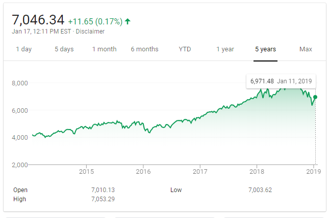
Thanks for your work on the App!
Many thanks for this app it’s fantastic!
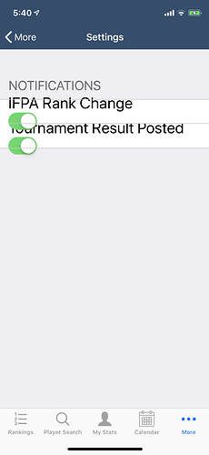
(To be fair, I see this problem in a lot of apps.) I use the Accessibility settings in iOS to allow me to set larger text sizes on my phone in apps that support dynamic text sizing (to accommodate my worsening eyesight). A lot of times, for some things like settings, the layout gets a little messed up:
Bug filed. I take accessibility concerns, especially re: potential disabilities, pretty seriously.
I’ll see how others in the Xamarin Forms community have approached this.
I’ve finally got an emulator that doesn’t show the search box! I will see if I can fix that. I am betting that’s kept a lot of android users away. I’ve also got a bunch of little things I worked on today.
Version 1.4.1 should be hitting the Google Play Store soon. Apple Store requires around 24 hr turnaround for app review. Here are the changes in the new version:
Fixed Bug where Settings page would render incorrectly if iOS accessibility font sizes were enabled
Fixed Bug where if a tournament result was posted out of sequential order, the app added the wrong activity feed item
Rankings graph on Player Detail Page is now log-scaled
Added Share Player and Share Tournament / Tournament Results links to the appropriate pages
Removed the Refresh icon on the Player Detail page. Player details are reloaded whenever the Player Detail page is loaded so the Refresh button was unnecessary
Changed Player Detail Results page to use different tabview that indicates which tab is selected more clearly
Fixed Bug in Android where some platforms did not display the Search Bar
I have some time tonight. I’ve got a lot of UI fixes committed, but I wanna squeeze one more feature in the next update
Should it be
a.) notifications when a new blog post / news happens
B.) a customizable watch list of favorite players?
I vote for the watch list. I can follow the Facebook page for blog updates.
Watch list 
